Seap

S.E.A.P. is a management software development company in the automation field, who collaborate with some of the most prestigious automation manufacturers.

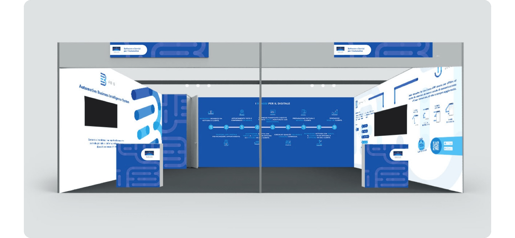
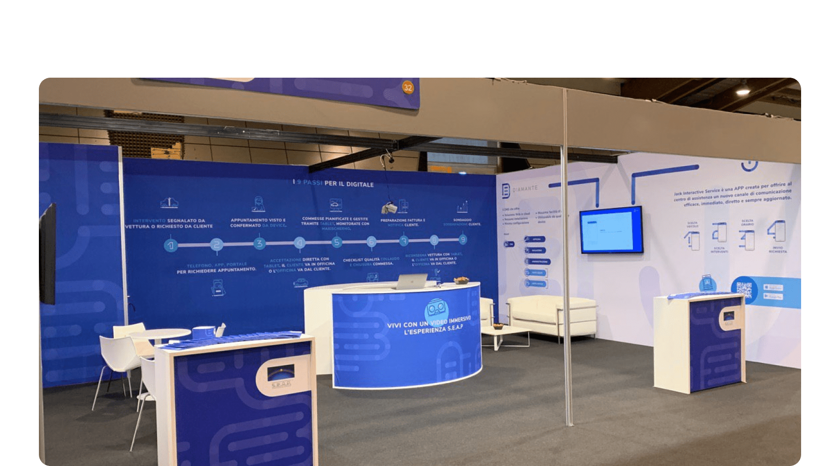
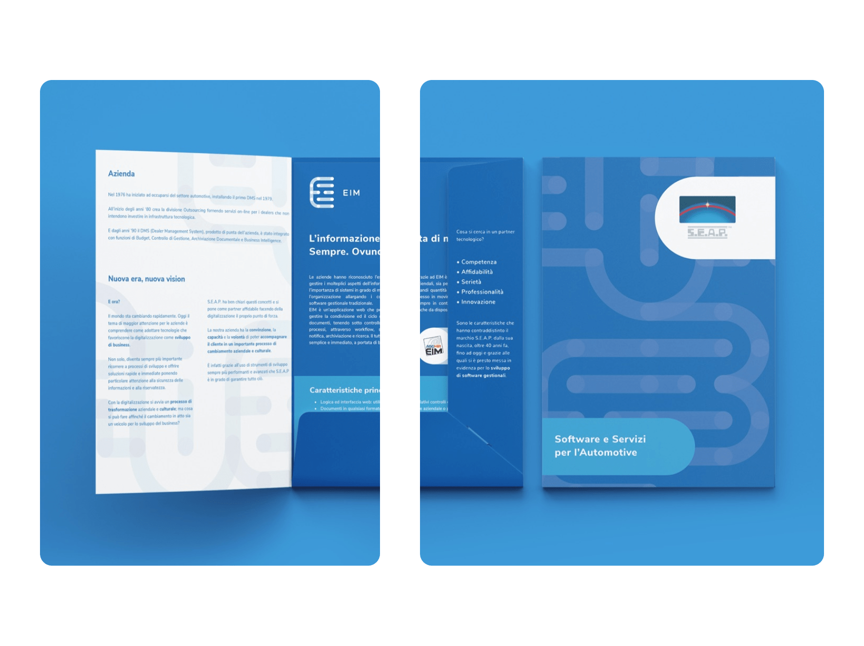
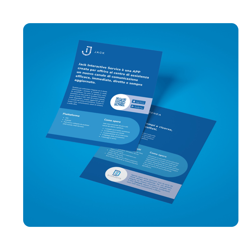
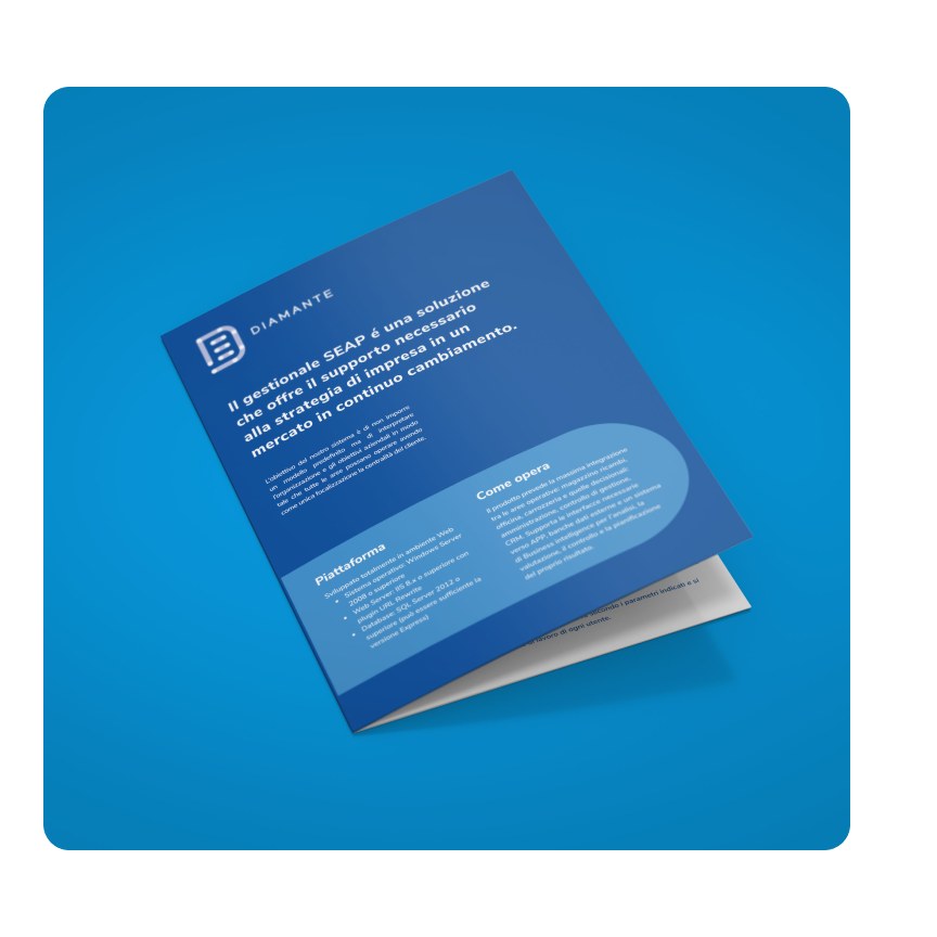
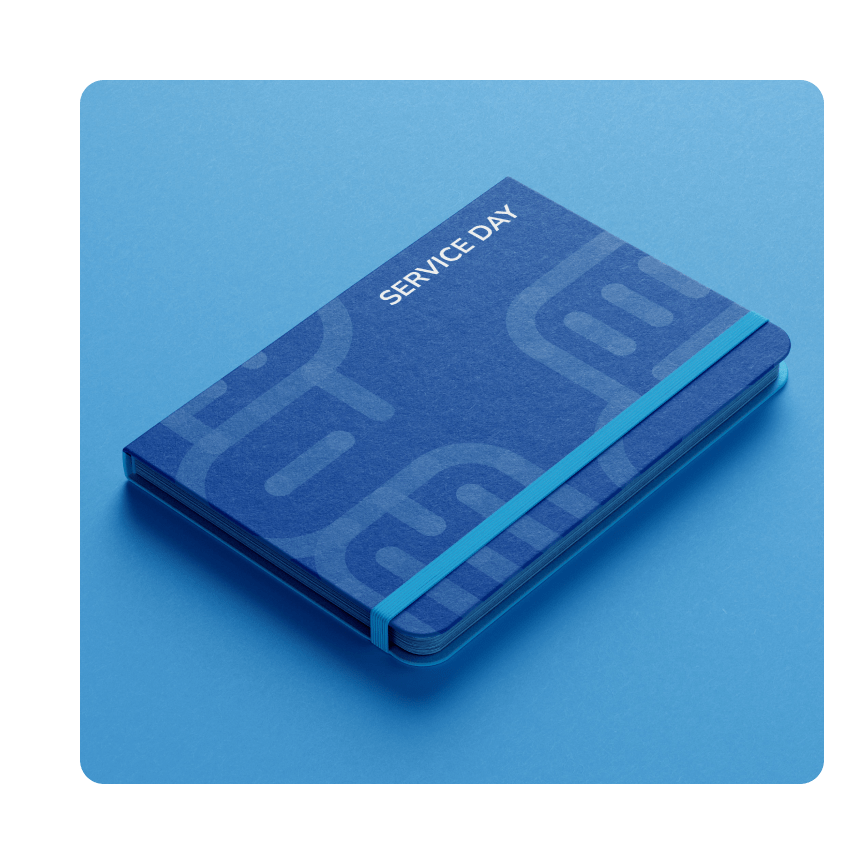
The task was to create logos of their products and their identity for “Serviceday 2019" event, as well as creating graphics of their stand and all brochures necessary for their target audience.

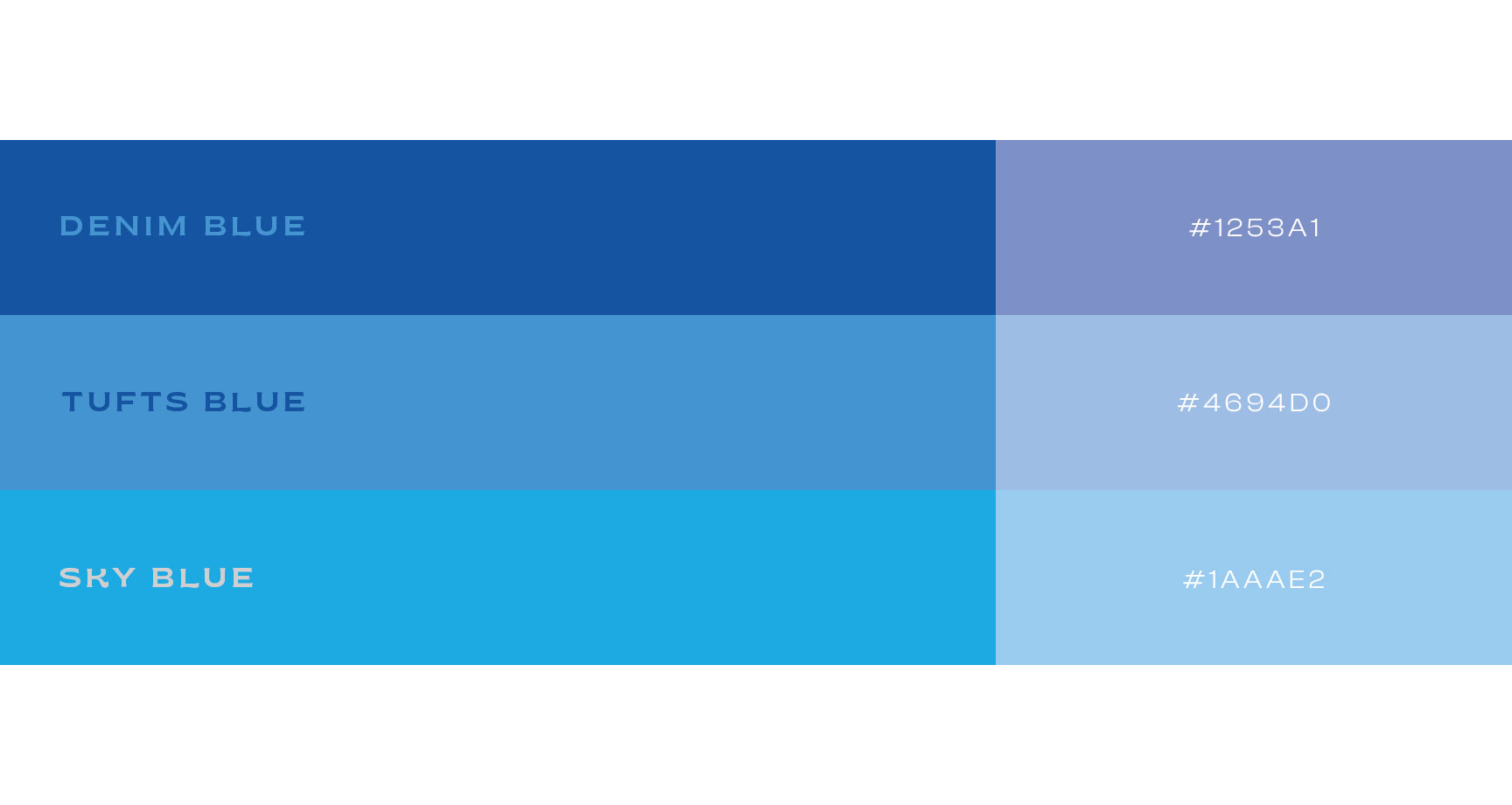
The graphic style we adopted has been carefully designed to reflect the concept of connection in different ways.
We used colour and shape which evoke a sense of cohesion and interconnection both visually and conceptually.

client

S.E.A.P.

creative fields

Art Direction
Graphic Design
Exhibition Design
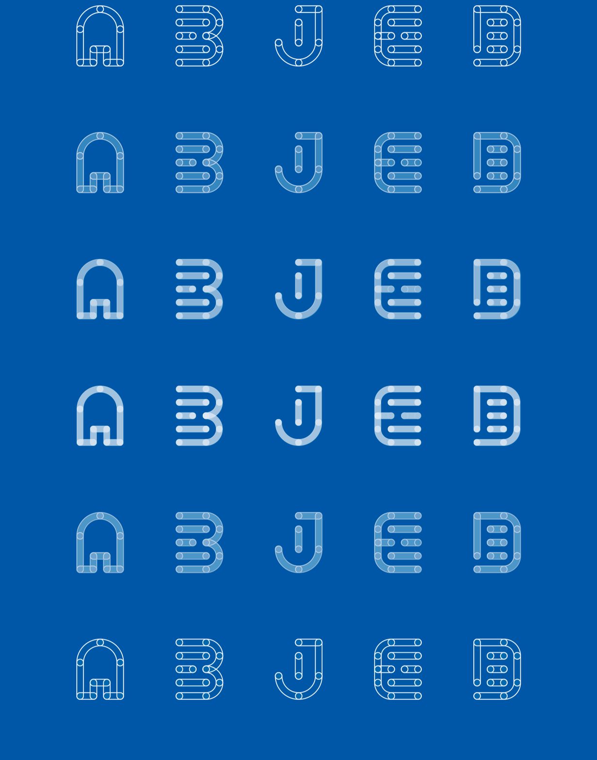
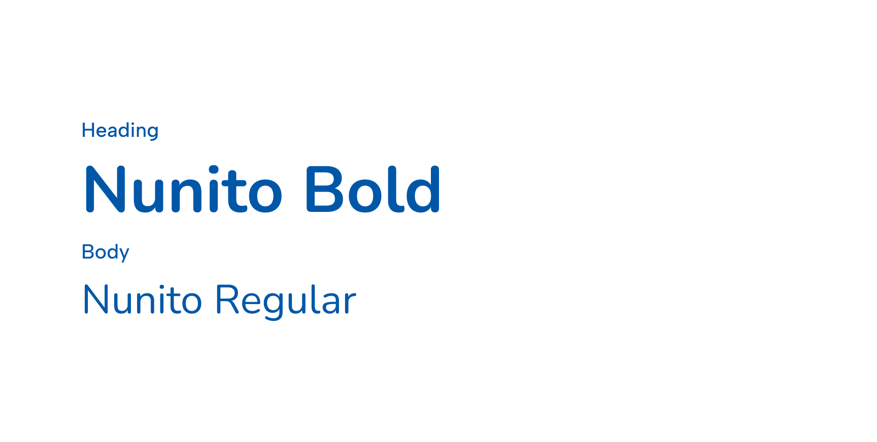
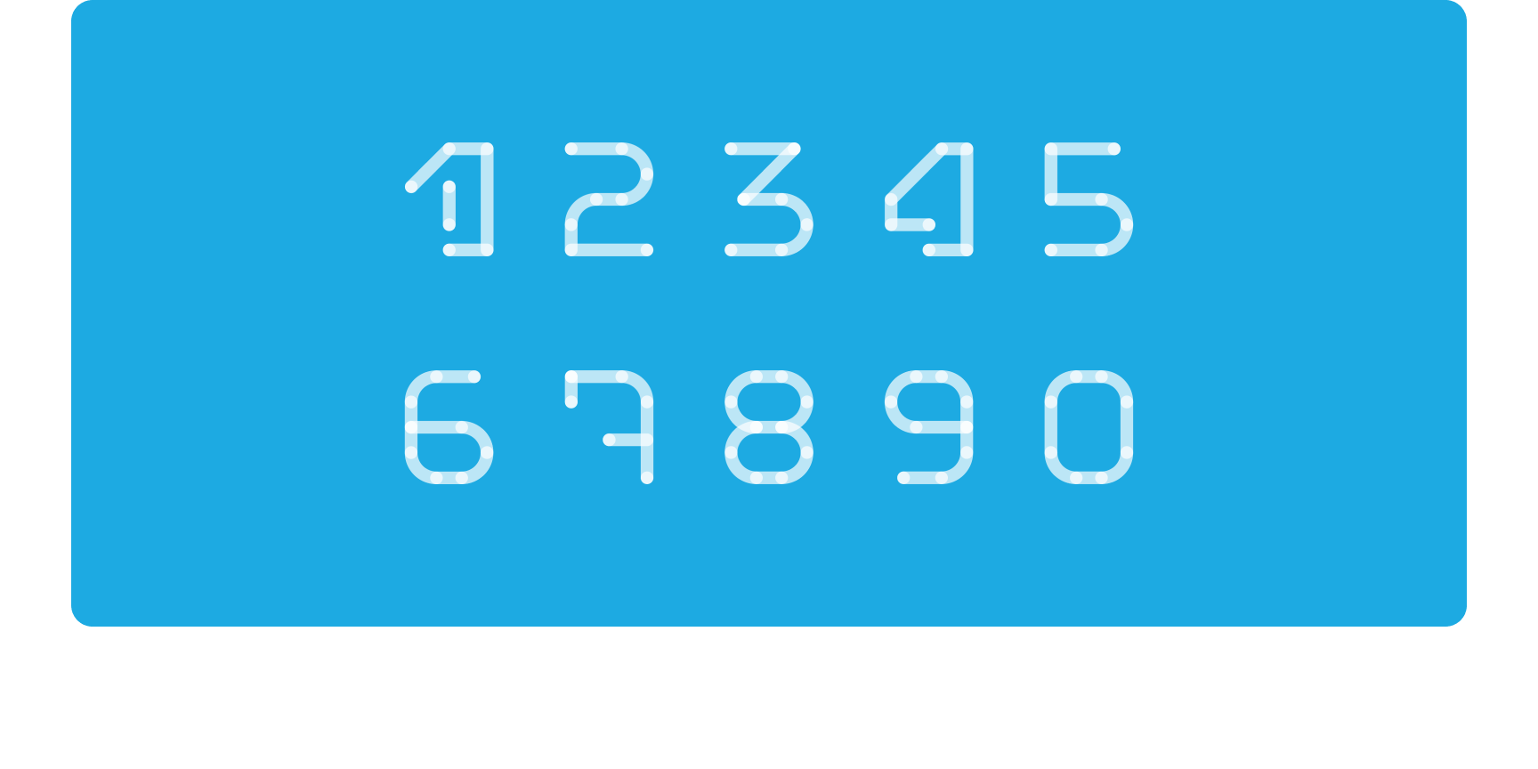
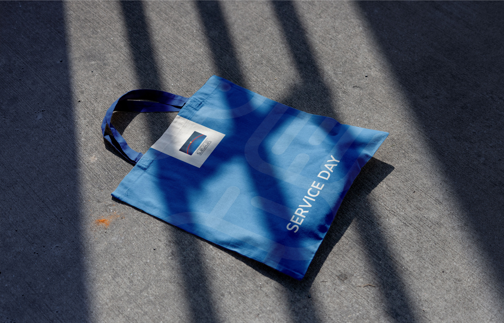
Sequence of the Seap sign on a blue background with letters and icon Seap triptych with automotive photos and workshop, support, and lift icons Seap triptych with booking, key handoff, and smartphone confirmation icons Seap palette with the Denim Blue, Tufts Blue, and Sky Blue shades Seap typography specimen with Nunito Bold headlines and Nunito Regular body text Seap numeral system drawn with dotted strokes on a light blue background Render of the Seap trade show stand with information panels and front desk Photograph of the Seap stand assembled at the trade fair Open Seap leaflet with panels dedicated to Jack and Diamante Blue Seap Service Day tote bag photographed on the ground with sharp shadows Seap leaflet with a QR code for the Jack app and a Diamante panel Diamante Seap leaflet on a blue background with descriptive text Blue Seap Service Day notebook with a light blue elastic band Jack app icon next to the Messages app in an iPhone dock
back to all projects